
Tutorial

Industry Context
The hobby retail market is crowded with stores selling the same products. The only sustainable differentiation is cultural legitimacy — becoming a destination that customers identify with, not just a place they buy from.
The Challenge
Tutorial faced a problem most retailers never solve: two fundamentally different audiences expected opposite things from the same space. Serious gamers wanted expertise and cultural credibility. Families wanted approachability and guidance. Serving one meant alienating the other.
Conventional branding would have picked a lane — dark and serious for enthusiasts, or bright and playful for families. Both choices would have left half the market cold.
Compounding this was an operational constraint that made the problem harder: renovation deadlines required color decisions months ahead of the brand strategy. The physical space had to be built before the brand was defined. Most agencies would have guessed.
The Insight
We didn't guess. We mapped seven competitors' color choices using CIELAB color space analysis — a method typically reserved for metro system design. CIEDE2000 formulas and Voronoi diagrams revealed what intuition had missed: light green and yellow were not just visually underrepresented in gaming retail. They were emotionally unoccupied territories.
Competitors fought over serious blacks and blues or playful primary colors. An entire spectrum of approachable yet energetic colors sat unused. The data showed lime green offered 20% greater visual distinction from the nearest competitor while psychologically balancing the playfulness serious gamers need and the warmth families seek.
The hidden truth: both audiences wanted the same thing — a space that respected their intelligence. The color was the signal that said "you belong here."
The Breakthrough
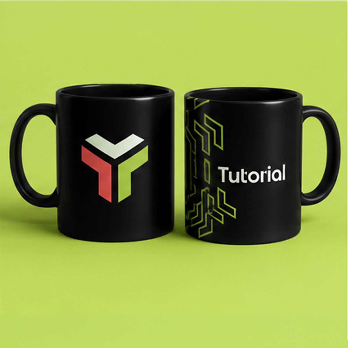
The symbolic solution emerged from the tension itself. A three-dimensional "T" shape — three interconnected rectangular prisms — represented the gaming community's fundamental values: modularity (games build complex experiences from simple components), interconnection (players strengthen through community), and pathways (every hobbyist follows a unique journey of discovery).
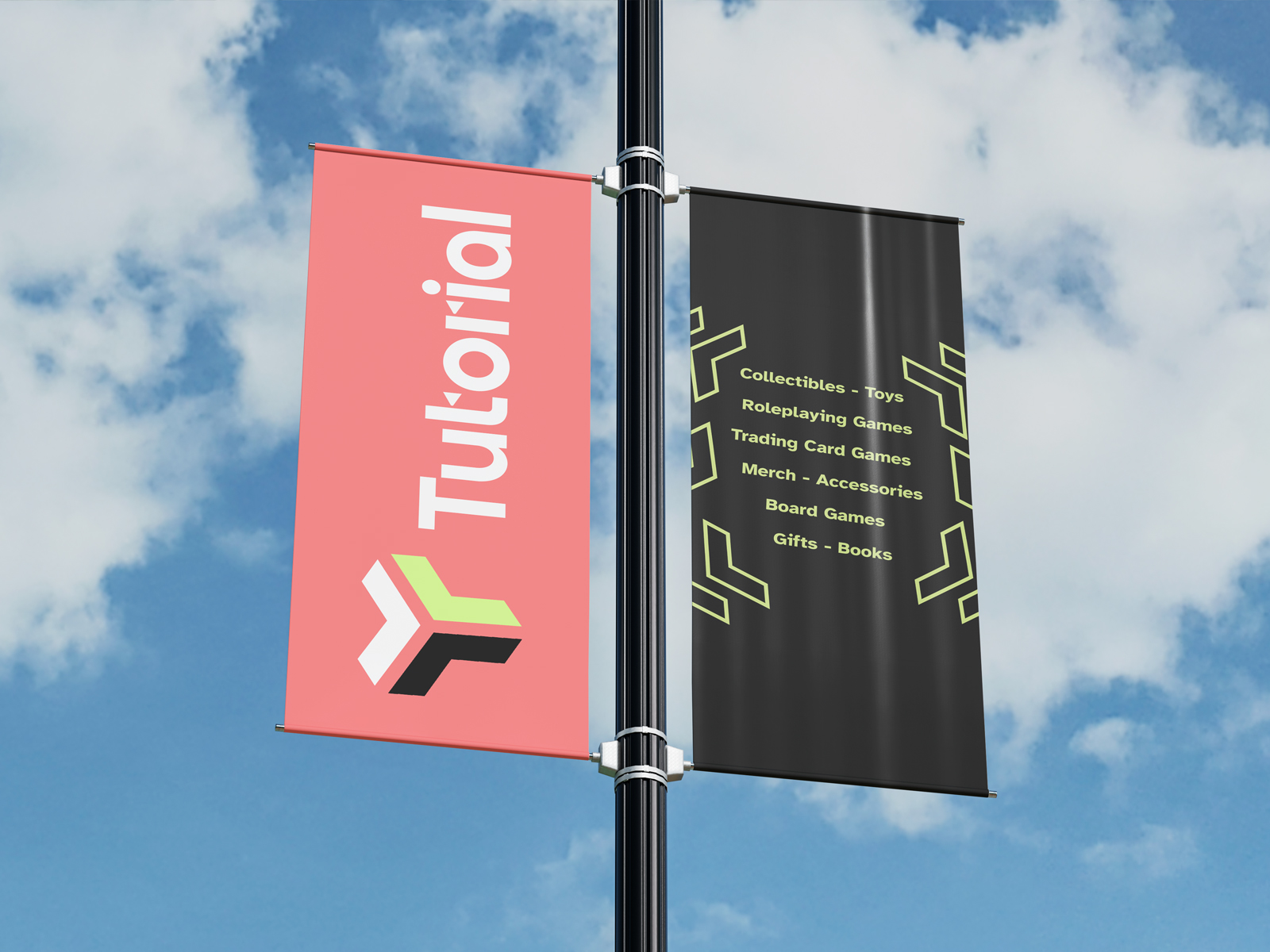
The breakthrough was recognizing this symbol could flex across contexts without losing meaning. On professional black backgrounds, it signaled sophisticated gaming culture worthy of serious investment. On bright lime green, it became approachable and family-friendly — without sacrificing its essential character.
The wordmark "Tutorial" completed the narrative. Not "seller" or "retailer" but guide — the expert companion who helps both seasoned gamers and curious families navigate their next adventure. The typography's clean modernism reinforced credibility while remaining accessible to parents intimidated by overly technical gaming environments.
This dual-nature approach solved the fundamental tension: how to honor the complexity serious gamers demand and the approachability families need, without compromising either experience.
The Resolution
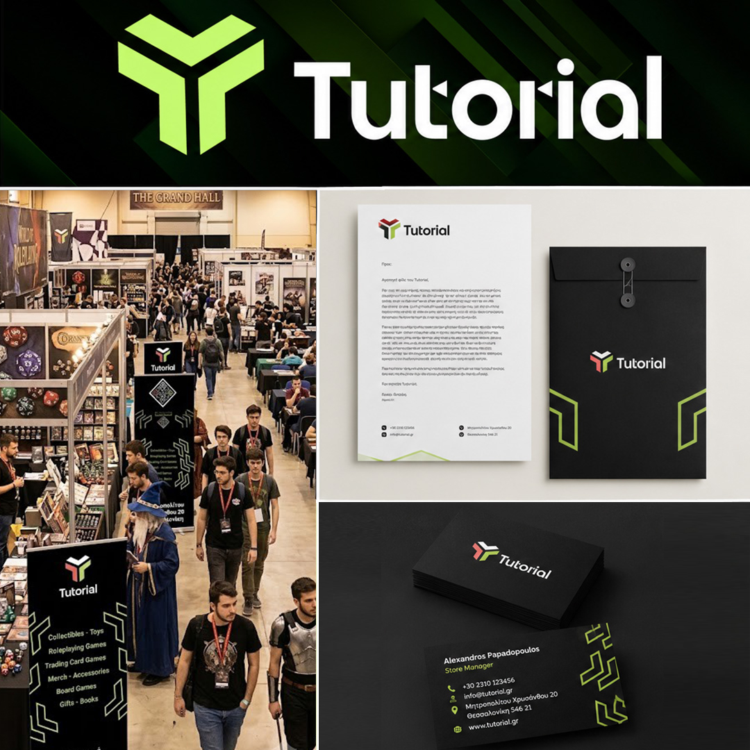
The lime green became Tutorial's signature — scientifically optimized for maximum market distinction, emotionally calibrated for community warmth. It threaded through every touchpoint: physical signage, digital presence, event materials, staff uniforms.
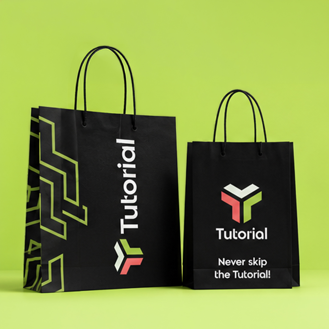
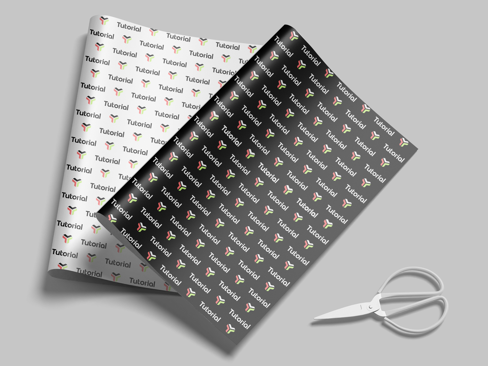
The modular logo system proved its strategic value immediately. Professional contexts — business cards, formal communications — used the multi-colored symbol on black backgrounds, establishing credibility with serious gamers. Community-facing materials — shop signage, event banners, social media — used the energetic lime green version, creating instant recognition and approachable energy for families.
Strategic messaging reinforced the dual positioning. "A comfy escape for nerds and families alike" made both audiences feel specifically welcome. The secondary line — "your go-to destination for personalized experience" — emphasized guidance over transaction.
Physical implementation required meticulous attention. The renovated space used lime green as energizing accent while maintaining sophisticated black elements that signaled serious gaming credibility. Even the business cards carried UV logo applications — a tactile dimension that let customers physically feel the symbol. Every touchpoint reinforced the evolution from product retailer to community curator.
The Transformation
Tutorial's owner Vicky Bei became what the space always promised: a community leader. The lime green became instantly recognizable — a signature that threaded through every touchpoint from signage to social media.
Serious gamers found the expertise and respect they craved. Families discovered welcoming guidance for meaningful gaming experiences. Tournaments and family game nights became fixtures in Thessaloniki's cultural calendar.
When Vicky saw the "Never skip the tutorial" motto, she responded: "We cannot possibly top this motto."
What changed wasn't just the visual identity. It was the relationship between a business and its community. Tutorial no longer competes on product selection. It competes on belonging — and that's a category no competitor can replicate.
Key Innovation:
Scientific color optimization for accelerated brand development
Deliverables:
- Complete brand strategy with dual audience profiles
- Scientific color palette development using CIELAB analysis
- Modular visual identity system with flexible applications
- Comprehensive touchpoint strategy and implementation
- Community-focused positioning and messaging framework
Results:
- 20% greater color distinction from competitors through scientific analysis
- Successful dual-audience positioning serving both serious gamers and families
- Accelerated renovation timeline met without compromising strategic depth
- Community event programming establishing Tutorial as Thessaloniki gaming hub
- Visual identity system flexible enough for professional and family contexts

Ready for your
success story?
Let's begin crafting your own symbolic identity.
Book your free consultation below to get started.