Bangers and Balls

The Challenge
Bangers and Balls began as a supper club but had ambitious plans to expand into a comprehensive food education ecosystem. However, they faced critical barriers to growth:
The Problem
• Strategic Confusion: Unclear positioning as they evolved from supper club to content creator and educator
• Unprofessional Brand: Their existing brand looked amateur and didn't match their expertise in foraging and food
• Limited Confidence: The team felt hesitant to show up consistently across platforms
• Expansion Paralysis: They wanted to launch multiple revenue streams (courses, products, memberships, speaking) but lacked the brand foundation to support it
The rebrand presented an additional challenge: a team with different ideas about direction. This could have created tension and indecision, but the right process would be critical to alignment.
The Approach
Brand Strategy Foundation
1. Archetypal Positioning: The Caregiver Rather than positioning them purely as educators or adventurers, we anchored their brand in the Caregiver archetype—emphasizing nourishment, community, and gathering. This reflected the heart of what they did: bringing people together around wild food.
2. Dual-Positioning Framework
• Expert Authority: Positioned as credible foraging experts and authorities
• Experiential Adventure: Emphasized the adventure and discovery aspect of food experiences
3. Audience Clarity Defined their core audience as experience-seekers looking for unique food experiences—people who valued discovery, learning, and connection through food.
Brand Identity Design
The visual identity needed to work across dramatically different contexts: intimate supper clubs, educational course materials, social media content, physical products, and speaking engagements.
The Solution: Versatile Core Elements
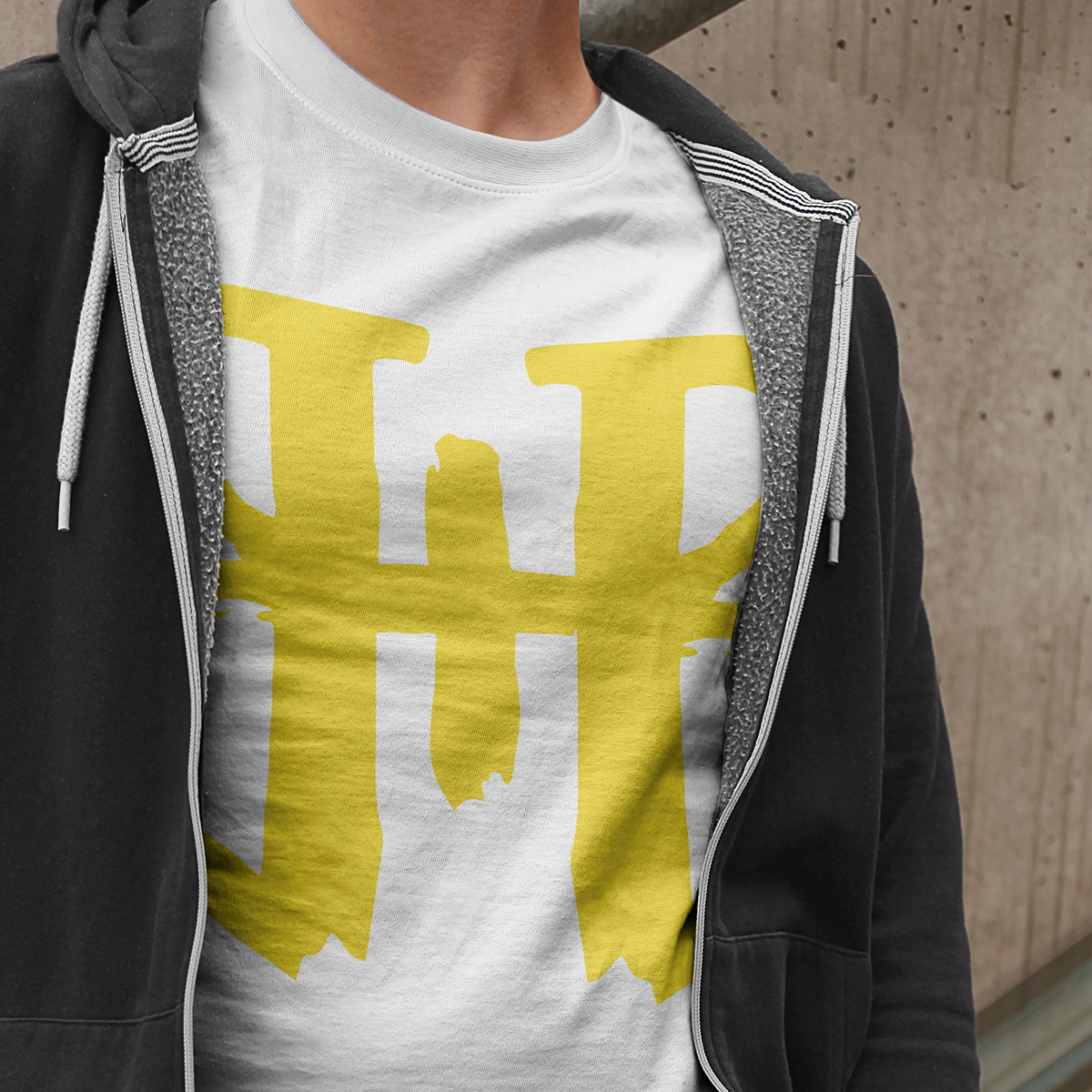
Logo Design A butterfly/heart monogram created from the "B+B" letters with a carved-on-tree texture.
Symbolism:
• Butterfly: Transformation, nature, and the foraging journey
• Heart: Care, nourishment, and community (Caregiver archetype)
• Carved Tree Effect: Organic, natural, and permanent—like their mark in the food education space
Color Palette Earth tones with a strong focus on moss greens—grounding the brand in nature and foraging while feeling fresh and alive.
Typography Modern fonts applied in organic ways—bridging professional credibility with natural, accessible warmth.
Photography Direction Lifestyle photography showing experience and community rather than just food shots—capturing the gathering, discovery, and shared moments that defined the brand.
The Results
Quantitative Impact
8x content output multiplication with a well-designed brand identity providing "safety" and structure, Bangers and Balls multiplied their content output by a factor of 8—going from minimal, hesitant posting to consistent multi-platform presence across Instagram, TikTok, and their website.
Revenue Streams Successfully Launched
• Online courses and workshops about foraging and food
• Physical products (books, foraging kits, food products)
• Speaking opportunities and engagements
Business Growth
• Increased conversions across all revenue streams
• Healthier bottom line and increased profitability
• Expanded from single-channel (supper club) to multi-channel business model
Qualitative Transformation
Before:
• Hesitant and uncertain
• Minimal content output
• Unprofessional brand perception
• Focused only on supper club
• Team alignment issues
After:
• Confident and clear
• Consistent multi-platform presence
• Professional, credible brand identity
• Multi-revenue stream business (courses, products, content, speaking)
• Aligned team proud to share their brand
Client Testimonial
"Dimi has an extremely analytical mind combined with creativity which is a rare but valuable mix. We worked with Dimi to develop our brand - logo, identity and brand look and feel. Often re branding can be a tense experience especially when working with a team with different ideas of directions.
Dimi took all of this out of it by the process he used, the questions he asked and what he provided. We loved our sessions as a team and we got goosebumps when we seen the brand logo! We couldn't be happier.
He gave us so much more than that - he helped us nail our target audiences, work out our vision, where we wanted to be and how we were going to get their leveraging our brand. We couldn't be happier and we can't wait to shout our brand from the roof tops. We are so proud of it but more importantly our customers get it! We have increased clarity which is leading to more conversions and a healthier bottom line.
We are so delighted we chose to work with Dimi and can't recommend him highly enough. He was an absolute pleasure to work with and produced an end result that gave us goosebumps with increased profits."
— Imogen Tinkler, Founder, Bangers and Balls
Key Takeaways
1. Clarity Multiplies Action: When you know who you are and who you serve, content creation becomes 8x easier
2. Design Enables Confidence: Professional brand identity removes psychological barriers to showing up consistently
3. Strategy Drives Revenue: Clear positioning opened doors to courses, products, and speaking—not just design polish
4. Process Matters: The right brand development process can turn potential team tension into collaborative excitement
5. Versatility Is Strategic: A flexible visual system that works everywhere is more valuable than a rigid "perfect" design


Ready for your
success story?
Let's begin crafting your own symbolic identity.
Book your free consultation below to get started.

